26 Dec Animating height in CSS
I recently ran into an issue where I had to transition the height of an element from 0 to auto. Typically this is needed when "pushing" in new content from a feed, or expanding a container with "Show More". On the comment section of this website, I achieved this by first appending the inserted element to location off-screen and then measuring the rendered height. Then I could animate the expanding container using an absolute height.
I wanted to find a more elegant solution to this problem. I encountered the [max-height solution](http://stackoverflow.com/questions/3508605/how-can-i-transition-height-0-to-height-auto-using-css), in which the maximum height is animated instead of the height. This works as long as the content is always less than your max-height. There are a few caveats, most notably the animation getting "stuck" (because the max-height is too high). When animating back to zero, it gets stuck at the beginning for a split second.
After toying around with the timing and max-height values, I decided to try and tackle the problem from another perspective. The "stuck" transition could possibly be rushed over by using transition timing functions. I tried ease-out (which slows down at the end). It seemed marginally better. I then decided to use
```
cubic-bezier(0, 1, 0, 1)
```
Which generates a timing function that looks like
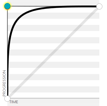
This rushes over the beginning of the animation where it gets stuck, and the end of the animation still turns out pretty nice. Check out the comparison I made on [CodePen](http://codepen.io/woah/pen/XXjabx)!
Comments